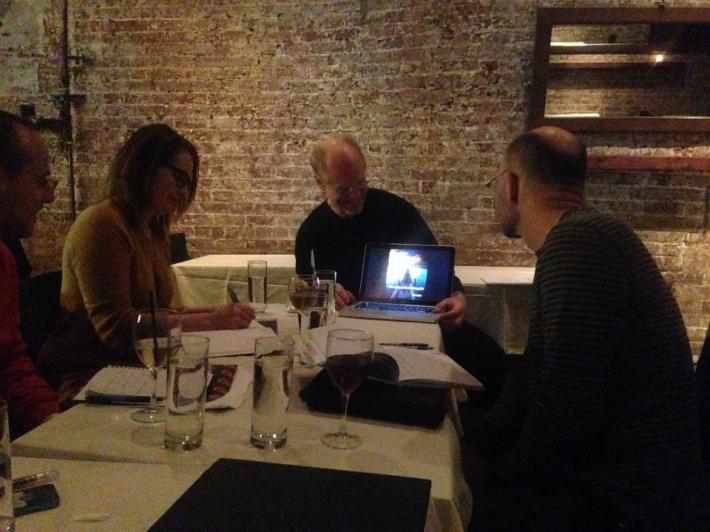
last night design pro roy wiemann translated years of experience (illustrating for the likes of the New York Times and the Smithsonian) into actionable nuggets of info for eager copywriters looking to transform their spec copy into something visually portfolio-worthy. if you weren’t able to join us, here are a few quick pointers to steer you toward a better designed DIY piece.
Shutterstock and Google Images = your new best friends.
DIY on the cheap? Google Images if rife with pictures you can borrow for your designs. If you’re prepared to invest time and a little more money, consider a month’s membership to Shutterstock, where you can download a couple hundred images for a spec copy project now (and a few to inspire another project down the road). roy’s tip—make it even cheaper by splitting the cost with a designer who needs some new images too.
don’t underestimate the influence of your font.
as roy illustrated in his presentation, the font alone can change the entire mood of your piece. he suggests sticking with a simple font to keep the focus on your copy, not on fledgling design skills.
resolve to check your resolution.
a poor resolution makes any piece look a bit off. 300 dpi is the standard for print while 72 dpi is fine for digital work. (stick to 300 dpi if you can, you can always size down!) also a quick reminder—work in RGB colors if your final piece will be digital; CMYK if you’re planning to print it out.
give your background some forethought.
a background that’s too busy will detract from your copy and overall design, and a background’s that’s too boring might make it fall a little flat. roy likes adding a little gradation to give a hero image a nice glow.
get familiar with Photoshop alternatives.
we know you’re not a designer and probably don’t want to shell out a small fortune for Adobe software. we were amazed and encouraged by the alternatives our event attendees had used to create some pretty impressive designs. don’t underestimate programs like MS Word and Powerpoint, and also check these out: Sumopaint, Gimp and Photoshop Elements (a pared-down, way-way-cheaper version of Photoshop).
you’re not a designer, but you know what looks good.
roy mentioned a thought from a j.d. salinger character who said to “write what you want to read.” keep that in mind when you’re plugging away at your design—use your intuition to make it something appealing. if you’re at a total loss, team with a designer to get your concept completed (we can help you find someone affordable! join our april networking event) or feel free to post your pleas for insight on our facebook or linkedin groups.
happy designing!
–kelley granger
kelley@thecopylabnyc.com
for more on roy: click here
our february event: C. Wonder’s sophie donelson sheds some light on copy that sells. prizes will be involved! learn more

