guest post: quickly learn the lingo of brandspeak

perk up your work with a word list

perk up your work with a word list

work on any account and you’ll quickly discover that every industry has a language all its own. on top of that, you’ll notice that every brand has its own special way of saying things, too.

when you’re writing for an account for a while, both brand and industry lingo become second nature. but when first starting a project, the words and phraseology of that trade may not be so obvious. and if you’re presented with a looming deadline, you’re going to need to learn the vernacular fast.

whenever i’ve been thrown into this situation, i’ve devised a little trick to get “word savvy” and build creative momentum. before ever writing a line of copy, i create a “words & phrases list.”

quite simply, i scour both the client’s and competitor’s websites and marketing materials, and jot down 50 to 100 industry-related words, phrases, and expressions for inspiration.
for instance, i recently started writing website copy for a brand of coffee. to avoid using the word “coffee” a gazillion times, my research provided me with alternatives such as blends, brews, roasts, beans, and grinds that i could sprinkle in.

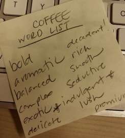
and while i’m sure the coffee is “delicious,” it would be pretty boring if i kept describing it that generically. some alternative adjectives I came across for my list included aromatic, bold, balanced, complex, decadent, delicate, exotic, flavorful, full-bodied, handcrafted, indulgent, lush, premium, rich, satisfying, smooth, and seductive.

because coffee was not top of mind prior to starting this project, would these words have popped into my head without doing this research? probably some, but not all.
another good way to find helpful terminology is to Google industry-related news stories, and to choose the “related words” options at rhymezone.com and the OneLook.com dictionary.

putting the list into practice

during my first week, when assigned to write emails promoting a $5 sampler offer, i pulled out The List. With a menu of coffee-related words at my disposal, the process of generating strategically-sound headlines became that much easier. here’s the result:

SIP, SAVOR AND SAVE.
Try these blends for just $5 each.

GET BEANS FOR BEANS.
Find new favorites for just 5 bucks.

New Perk for New Customers:
BUY & TRY FOR JUST $5.

while wordplay like this may be frowned upon by some brands, others just love it. so know your client.

beyond words, are phrases. and if you’re working on an established brand, chances are, they have an established way of saying things. as writers, we should all strive to develop original and inventive copy. however, some clients are loathe to veer too far from their approved terminology, which they prefer to use again and again to “reinforce the brand.”
so, if in your brand word audit you see the same expressions used over and over again, you may want to throw them in here and there to put a smile on the client’s face. for this particular brand of coffee, pet phrases i massaged into the copy included:

– Distinctively rich, smooth taste that’s never bitter.
– Make your life rich and flavorful every day.
– Experience a uniquely luxurious coffee indulgence at home.

once you’ve compiled your word and phrase list, you then have a database of thought starters you can refer to whenever you need inspiration.

something to keep in mind: the word list may not be the best approach for highly conceptual projects, which initially, are less about words and more about big ideas. but when faced with fast turnaround for a brand or category that’s new to you, the word list could be just the thing to quickly get your creative juices flowing.

what writing tips and tricks work for you? share them here in the Copy Lab!

by mitch lemus, copywriterMitch

over the course of his copywriting career, mitch lemus (www.mitchlemus.com) has written about everything from automobiles to airlines, fast-food to fashion, and technology to travel at some of new york’s top agencies. accounts include Wendy’s Hamburgers (The Kaplan Thaler Group), Ford (Razorfish), and Citibank (Atmosphere BBDO). mitch has also worked directly with Barnes & Noble, American Express, PricewaterhouseCoopers, and Capital One. when not getting people to buy, he hopes he can get them to laugh — reading his short stories, parodies and social satires on Pen & Pixel.

dispatches from ad school: meet elina of Miami Ad School

elina rudkovsky, our ad school blogger

introducing elina rudkovsky, our ‘dispatches from ad school’ blogger

i was first introduced to advertising at 19, after dating an art director who worked at GREY advertising. it wasn’t long after that, that i became enamored with an industry i knew almost nothing about except that everyone had a funky haircut, checked their blackberrys incessantly, and referred to themselves as “creative.” i always thought being “creative” meant that you didn’t hate the 45 minutes you spent in art class, or that you’ve been to every museum in new york city, by choice. looking back, i’m not sure what it was that i found appealing but i began to feverishly pursue advertising even after my relationship was over.

the truth is, i think i may have always been a “creative” despite my dislike for the MET (sorry, everyone). i am a writer, always have been. however, coming from a moderately conservative family, i was reluctant to deviate from the norm to become one, professionally. what was i going to write about? did i want to publish a book? was i ready to take on the role of starving artist? i wasn’t sure, but i did know that writing was a passion of mine that i couldn’t just give up on. for years i found comfort in the rips of an old leather couch harbored inside a neighborhood coffee shop, where i spent weekends curled up with my laptop, allowing my imagination to take me on adventures that only the power of the written word could.

i decided on the copywriting program at Miami Ad School after i realized that getting a job in advertising is like trying to have a child without a partner: sure there are ways around it, but ultimately you need a mate and in this case, a portfolio and an art director to bring it to life. starting Miami Ad was similar to starting kindergarten. everything was new, writing no longer seemed innate (wait till you get to Photoshop, it’s like learning how to walk again), and there’s a strong chance you might cry, maybe even on your first day. i’m serious.

during one of my first weeks at Miami Ad, a peer of mine said “we are all in this together” as we stood on a snowy stoop outside the building that is 10 jay st, waiting for our partner to show up to a group meeting. on a saturday! however, what she said was something that has always stuck with me. it has become my comforting go-to thought whenever chaos ensued, and chaos ensues a lot.

i could sit here and bore you with the technicalities that come with ad school and spew out words like “shop” (fancy ad word for agency), “spots” (fancy ad word for commercials/radio announcements), “pixels” (still don’t really know what this means), addy’s (advertising award), but it won’t really capture the essence of what this experience is all about. that’s what ad school is, in a nutshell, an experience. here’s the thing: you will work really hard and as result you will fall in love with your work and just as quickly you will begin to hate your work. you will get over it and move on. you will feel pressure. you will learn about rejection. you will become okay with rejection (or as ok as you can get) because criticism will motivate you to do better. you will get competitive. you will not become an asshole, and if you do become an asshole, do everyone else a favor and pick another career choice because nobody will want to work with you. you will become overwhelmed, and if you’re anything like me, an ” emotional neurotic wreck but funny and composed when necessary” (direct quote from one of my past instructors) you will cry, in the stairwell. but you will not be alone, and in that lies the silver lining. there will always be someone with you on that same stairwell, whether an instructor or a peer, reassuring you that can do it. whatever the “it” may be. i consider myself exceptionally lucky to have found a group of people that are (although in direct competition with me) incredibly supportive, making life seemingly unimaginable without them.

if there’s anything that i hope you take away from this post, it is that ad school is not just an environment where you go to work on your book, but rather a place where you will learn of the greater picture. from concepts, to brands, and yourself as a person, your mind will shift perspective and grow. for me, it’s been a challenging albeit a life-altering experience thus far that i know will be hard to say goodbye to come next december, and i hope it is the same for you.

by elina rudkovsky

about the author: When Elina isn’t writing for or about advertising, she is with her therapist talking about it. Check her out at ElinaRudkovsky.com

being social in a digital world: tips for writers on social media strategy

social media is meant to be just that — social. as a writer, having a solid strategy for tweeting, commenting and posting in the online arena can help build your personal brand, your network, and it can attract potential employers and clients.

at sign

so what are you waiting for? it’s great to follow others, but it’s also smart to get out of the shadows and interact. as you wade through the waters of going social, here are a few things to keep in mind:

  • before simply posting your every whim, outline a strategy. which platforms will you use? will you have time to post enough to keep followers engaged? how personal are you willing to get?
  • take note of what YOU like reading on your news feed and what you find entertaining. use that to decide what unique spin you can contribute to the digital sphere.
  • post worthwhile content and the followers will come. updating peeps on your every waking moment may not be the way to go…just saying.
  • follow, like and engage with other writers, designers and creative groups (like The Copy Lab!) to make connections and help get your name out there.
  • not everything you post must (nor should) be work-related. social media lets your individual spark shine bright — a valuable tool as you aim to differentiate your voice in the crowd.
  • make the time to proofread. typos abound on the web, but your feeds should reflect your professional prowess.

remember, your personal brand’s social media campaign is a public venture. it has the potential to be far reaching and impactful, so it’s worth taking the time to devise a strategy. learn as you go, try different approaches and, most importantly, have fun with it.

let’s all learn together! please share your thoughts, tips and social experiences (good and bad). leave comments below or connect with us on Twitter and Facebook.

by meredith clinton bell

email copy that equals stellar sales

need help connecting the dots between your email copy and its sales results? sophie donelson, editorial director of C. Wonder and Monika Chiang, presented pertinent tips on how to make your subject lines, headlines and subheads rock the analytic charts. here are a few quick tidbits from our charming guest speaker if you weren’t able to join us:

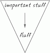
tap the inverted pyramid technique.the inverted pyramid
break out your notes from journalism class and use this article-writing tactic to prioritize your message. the premise is simple: the most important info goes at the top, followed by significant details, followed by the least newsworthy stuff.

grammar rules: bend (or break!) them.
emails should be evocative and stir feelings. do whatever you have to do to make them that way. have a field day playing with fragments, hyphens and weird punctuation as long as your message stays clear.

subject lines: don’t get in the way of what’s tried and true.

new arrivals
sale!
introducing [insert new product]

you might balk at these subject lines because they seem so… blah. but sometimes what seems boring is actually just a straightforward way to get results — according to sophie, the three lines above are almost fail-proof when it comes to scoring good open rates. want some extra oomph? sophie swears by an ellipsis to add intrigue and up your opens.

stay out of spam: avoid these words.
don’t use the words “free,” “help,” “reminder” or “percent off” (the symbol % is okay though) in the subject line and you’ll help keep the email from the junk folder.

think of the subject line as a promise.
then ensure your content fulfills that promise once the email is opened. sophie offered a tip she read at copyblogger.com, a writing resource she recommends: the best subject lines tell what’s inside, the worst sell what’s inside.

hop online to cwonder.com and monikachiang.com and sign up for their mailing list to check out some of these tips in action.

we’ll see you next month (tuesday, march 12th to be exact) when brand strategist jean railla discusses the digital frontier and the space where brands and culture collide. reserve now to save your spot!

–kelley granger

guest post: nail polish and power tools

Image

“are mermaids real?”

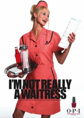
“i’m not really a waitress.”

no one creates deep-seated want based on name alone like the makers of nail polish.
those are actual names, and yes i’m the sucker who bought that shimmery purple and that garnet red, convinced into purchase by clever names. ok, it didn’t hurt that they were cheap too, but if they had simply been called purple and red, I might have thought twice.

why? what is it about a great name that worms its way into the lizard brain and drives desire? in the case of frivolous stuff like nail polish, it’s the abstract concept; like Infiniti first sold the idea of a car, products like this sell the idea of the color.

the right name makes you smile, conjures images of personal meaning, maybe makes you laugh til you pee a little. imagine if nail polish were sold the way power tools are: “OPI red: 8 grams polyethylene sparkles per ounce, spreads easily.” yawn.

speaking as a woman who’s handy with jigsaws, nail guns and drills, i know i’d be loathe to purchase any power tool marketed like nail polish. Dewalt would lose respect overnight if they created a women-only power tool campaign.

who are you? an opalescent-tailed mermaid? a reliable carpenter installing that hot tub I want in my bathroom? don’t condescend, tell me a story. engage me to dream about what I could do with your brand. speak to me in the voice that makes sense for you.

michele gilman

a creator of copy + visuals for Trader Joe’s, michele also has years of improv comedy experience and brings a signature quirkiness to her blog at www.whatisabrand.wordpress.com. she’s currently working on a Mediabistro advertising certificate, and helming Designvoice, Inc. (when not enjoying her 7-year-old daughter). follow her on twitter at @mamagills.

CL snapshot: sophie donelson

Image

a flash interview with sophie donelson

editorial director, C. Wonder & Monika Chiang

three words that sum up your job:

deadline is today. (or, collaborative, challenging and super-fun.)

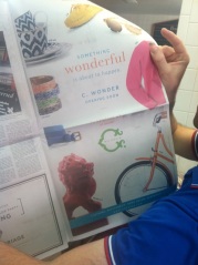
C. Wonder's first New York Times ad, 09/12

C. Wonder’s first New York Times ad, 09/12

the highlight of your career (so far!):

despite spending almost a decade as an editor and journalist for national magazines, the return policy on the C. Wonder receipt is probably my widest published and most-read “work” and therefore a highlight. but opening the C. Wonder store last fall and seeing my work simultaneously splashed across The New York Times, taxis, tv and billboards was a crazy and memorable high.

the best advice you’ve ever been given:

don’t kiss up, kiss down. (i.e. it’s your intern, not your boss that’ll give you a big break one day.)

if you weren’t a creative, you’d be:

happier. just kidding. probably a zumba instructor or a d-list cable show tv host. <– not kidding.

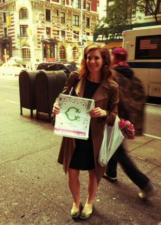
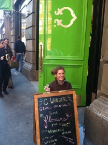
when i say i write a lot for c. wonder, i mean i really do write it! this is me on opening day of our soho flagship.

when i say i write a lot for C. Wonder, i mean i really do write it! this is me on opening day of our soho flagship.

copy or campaigns you admire:

i’m always delighted by the inventive copy penned by Kiosk, the soho (and online) shop. they tell funny, honest stories and never let fancy language hinder the message. it’s a remarkably effective sales technique. and Journelle. it’s hard to spin lingerie in a fresh way almost every day and they do it with elegance and verve. and i like the way Land of Nod and Boden include thoughtful messages on collateral like e-com packaging.

best two reasons to attend your Copy Lab event:

1. high probability you or your employer (and probably both) will make money off some of the ideas i’ll share. 2. you’ll probably laugh a bit. i’m prone to using inappropriate language and telling off-the-record stories. sign up now    more details

enliven a mailbox!

Image

advertising and catalogs have migrated to digital, and direct mail has waned, yet it can still serve a unique purpose and present creative challenges. useful for micro-targeting key groups (neighborhood residents, surfers, horse owners), it’s most effective when it arrives with a sweet offer you simply can’t refuse, or a gift, or something that will elicit a smile. all three would be ideal.

an example would be a lingerie boutique on the lower east side mailing an announcement for a grand opening to women in the area. the mailer could be shaped like a garter, made of plantable seeded paper, feature an offer of 25% off of a purchase, and include a silk stocking for one leg – the other has to be picked up in the boutique (in the correct size, if necessary).  that’s so much more engaging than a digital experience.

here are some angles to save direct mail from the trash bin, or to keep it interesting for you as its mastermind:

–  an unusual shape or presentation, or a shape that shifts into another shape such as a pop-up box.

–  a coupon or ultra-tempting offer (free glass of wine with dinner)

–  include a promotional item that will be of use; examples: a fridge magnet, breath mints or color wheels

–  the mailer pulls double-duty as something else — an origami animal shape or paper wallet

–  recipients love games and challenges such as cracking codes, filling in blanks, crossword puzzles, holding copy up to a mirror to read it, pinwheels and other unorthodox presentations

–  recycle-able paper, preferably seeded – scented paper is interesting too

–  if you can tell a story with your mailer, all the better – people love stories and being entertained. If you’re going to intrude upon someone’s mailbox and time, be prepared to make up for it with something very amusing.

enjoy these crazy brilliant direct mail examples: http://tinyurl.com/7hzss93

and tell us which piece of direct mail stands out as best in your memory (to keep our inspiration flowing).

by kim taylor

the power of networking

even if you sit behind a computer to do your work, in this digital world, we can’t forget that personal relationships still matter — a lot.

handshake

through social media we connect with, friend, and link up with hundreds — sometimes thousands — of people, some of whom we may never have even met. add the power of a face-to-face personal relationship and you can help create more effective lasting impressions.

enter: the importance of networking.

it doesn’t matter if your end-goal is to get a new job, more freelance work or to just get tips from your peers, connecting with other creatives like yourself is a must-do. it can help you get motivated to start that next project, learn a new skill, or maybe you meet your next partner or land a new gig. important opportunities you have yet to consider could be lurking at every turn.

sometimes it’s hard to put yourself out there. but at The Copy Lab, we’ve got your back. that’s why we’ve planned an event that cures wallflower syndrome and makes networking more approachable, less stressful and better than ever. it’s our speed-date networking event slated for tuesday, april 16 from 7 – 9:30 pm at revel in the west village.

a few things to help you prepare for worthwhile networking:

  • make sure your linked in profile is up-to-date and reflective of your creative genius (people will be checking you out!)
  • bring copies of your stellar, error-free resume and plenty of business cards to hand out
  • follow up with your new connections via email, LinkedIn, Twitter, etc.
  • did i mention bring plenty of business cards?

who knows where the invaluable information you glean from other creatives going through what you are will take you.

a bit more advice? reserve your spot for some quality speed-date networking now. keep checking our site for more events; new dates are always being added.

by
meredith clinton bell

The Copy Lab’s list of the top 10 super bowl commercials

while most of the country was watching the game, creatives were tuning in for the biggest advertising day of the year. here’s our rundown of the top 10 commercials:

• #10: two broke girls — a little plug by CBS (not the first, not the last), this ad was a way for the home of super bowl 47 to promote one of its shining comedies.

clarity score: 10/10. attractive, appealing, and awesome — a triple a scoring for the commercial since you knew exactly what they were selling.

• #9: the late show — CBS also promoted its nighttime flagship offering, the late show with david letterman, at the expense of rookie indianapolis phenom, quarterback andrew luck.

clarity score: 8/10. although in the beginning it wasn’t 100% clear who or what the commercial was about, by the end we realized it was all about the super bowl, the late show, and quarterbacks.

• #8: E*Trade ‘baby’ — making his annual appearance, the baby hasn’t aged considering a year has passed. while E*Trade offers to show you how to save money, the baby’s aim in this commercial is to do the exact opposite.

clarity score: 7/10. it was a little typical, but still hysterical. while some things never age, the E*Trade baby may be an exception.

• #7: Time Warner Cable’s the walking dead “clean up” — the zombie craze is still in full swing, and AMC’s the walking dead is still at the forefront of the trend. Time Warner cable, however, is taking a little bite of the action too.

clarity score: 9/10. while the zombies or “walkers” were the focus of the commercial, the narrator made sure to mention Time Warner Cable in a “lively” fashion.

• #6: Samsung Mobile USA, “the next big thing” — the dynamic duo seth rogen and paul rudd are back in action as they expand the “galaxy” of Samsung’s audience.

clarity score: 7/10. while incredibly entertaining to watch the “knocked up” pair together, the commercial itself was a lot like the super bowl — a bit sloppy. however, with a cameo  by lebron james, Samsung was able to successfully convey its message about #thenextbigthing being already here.

• #5: Mercedes-Benz, “soul” — this much-anticipated commercial has been teasing football and Mercedes fans for weeks (and Rolling Stones’ fans too, with sympathy for the devil). safe to say… it wasn’t a letdown. much like last year’s Kia commercial that featured rock band Motley Crue and hot supermodel adriana lima, this year’s offerings featured a slew of celebrities including, willem dafoe, usher, and Victoria Secret model kate upton. and you don’t have to trade your soul to enjoy them.

clarity score: 10/10. right from the start, you knew exactly what the commercial was for: Mercedes Benz; it was extremely clever and downright sleek.

• #4: Volkswagen, “get in. get Happy.” — this one made some noise prior to the super bowl, as many felt it had racist implications. its reception was more island-cheerful than stuffy-and-uptight.

clarity score: 10/10. though silly in the beginning and a little bit confusing, the commercial from Deutsch was warm, far from racist, and far from derogatory. not to mention delightfully creative.

• #3: Kia Sorento, “space babies” — for parents who have heard the dreaded five-word question, “where do babies come from?” Kia Sorento provides an inventive answer that involves a cute astronaut penguin.

clarity score: 10/10. right away you knew where the commercial was leading, you just didn’t know how it was going to get you there. it provided a twist: parents find most often that kids know more than they imagine.

• #2: Jeep, “whole again” — a major part of this commercial had to do with oprah, and it was touching. it reached the heart and soul of those who carry America on their shoulders and in their hearts, along with those who admire the nation’s heroes.

clarity score: 10/10. if this commercial didn’t bring a tear to your eye, i don’t know what will. without the appearance of any soldiers until midway through the ad, you knew it was about those trying to not only protect our country, but to find their way home.

• #1: Taco Bell, viva young — hands down, my favorite commercial of the night. it takes a group of elderlies and, well, reminds people what it means to be young again…thanks Taco Bell.

clarity score: 10/10. while fun (much like the featured band), it also was very imaginative and creative. at the end, I know I wanted a steak quesadilla, chalupa, or soft shell taco. viva young!

by
Joseph Melendez

design crash course for copywriters

Image

last night design pro roy wiemann translated years of experience (illustrating for the likes of the New York Times and the Smithsonian) into actionable nuggets of info for eager copywriters looking to transform their spec copy into something visually portfolio-worthy. if you weren’t able to join us, here are a few quick pointers to steer you toward a better designed DIY piece.

Shutterstock and Google Images = your new best friends.

DIY on the cheap? Google Images if rife with pictures you can borrow for your designs. If you’re prepared to invest time and a little more money, consider a month’s membership to Shutterstock, where you can download a couple hundred images for a spec copy project now (and a few to inspire another project down the road). roy’s tip—make it even cheaper by splitting the cost with a designer who needs some new images too.

don’t underestimate the influence of your font.

as roy illustrated in his presentation, the font alone can change the entire mood of your piece. he suggests sticking with a simple font to keep the focus on your copy, not on fledgling design skills.

resolve to check your resolution.

a poor resolution makes any piece look a bit off. 300 dpi is the standard for print while 72 dpi is fine for digital work. (stick to 300 dpi if you can, you can always size down!) also a quick reminder—work in RGB colors if your final piece will be digital; CMYK if you’re planning to print it out.

give your background some forethought.

a background that’s too busy will detract from your copy and overall design, and a background’s that’s too boring might make it fall a little flat. roy likes adding a little gradation to give a hero image a nice glow.

get familiar with Photoshop alternatives.

we know you’re not a designer and probably don’t want to shell out a small fortune for Adobe software. we were amazed and encouraged by the alternatives our event attendees had used to create some pretty impressive designs. don’t underestimate programs like MS Word and Powerpoint, and also check these out: Sumopaint, Gimp and Photoshop Elements (a pared-down, way-way-cheaper version of Photoshop).

you’re not a designer, but you know what looks good.

roy mentioned a thought from a j.d. salinger character who said to “write what you want to read.” keep that in mind when you’re plugging away at your design—use your intuition to make it something appealing. if you’re at a total loss, team with a designer to get your concept completed (we can help you find someone affordable! join our april networking event) or feel free to post your pleas for insight on our facebook or linkedin groups.

happy designing!

–kelley granger

kelley@thecopylabnyc.com

for more on roy: click here

our february event: C. Wonder’s sophie donelson sheds some light on copy that sells. prizes will be involved! learn more